Rate the signature above you!

Re: Rate the signature above you!
Which is when you use underscores and sample the colour of the forum background, and use that as the colour of the underscore so that it blends in. Like this. <- Like that.

-
boganbusman

- Unbeatable

- Posts: 5142
- Joined: 03 Sep 2004, 12:09
- Location: Mute City
- Contact:
Re: Rate the signature above you!
Which is what you do when you have way too much time on your hands.
-
Porsche-AG

- Unbeatable
- Posts: 2581
- Joined: 22 Jun 2006, 03:12
- Location: Canada
Re: Rate the signature above you!
Dont cheer him on. His E-net-ego will only grow bigger.Porsche-AG wrote:Well said, bogan.
korge

Re: Rate the signature above you!
Creativity: 10 (lollllllllllllllllllllllllllll)
Appearance: 0 (text =D)
Difficulty: 0 (text =D)
Appearance: 0 (text =D)
Difficulty: 0 (text =D)


Re: Rate the signature above you!
9
BTW, mine... I did most of the smoke, so only that tiny car bit is an in-game shot.

-
Carcrazy

- Unbeatable
- Posts: 4082
- Joined: 28 May 2006, 05:08
- Location: /// .Happy in Exile. \\\
- Contact:
Re: Rate the signature above you!
Creativity: 7 - It's a car sig, but I like it... 
Appearance: 7 - Everything blends pretty well together
Difficulty: 4 - Making smoke in photoshop isn't that hard, but it's still a great sig
(I also like the tiny details you added, like the lines behind your name, are added +1 after the first three letters...)
Overall: 5.7
Appearance: 7 - Everything blends pretty well together
Difficulty: 4 - Making smoke in photoshop isn't that hard, but it's still a great sig
(I also like the tiny details you added, like the lines behind your name, are added +1 after the first three letters...)
Overall: 5.7


Re: Rate the signature above you!
Creativity: 6 - its looks like a crop to me..simple
Appearance: 7 - Everything blends pretty well together
Difficulty: easy layers.= easy 5-7 min work..nothing special..
overall . ~6
Appearance: 7 - Everything blends pretty well together
Difficulty: easy layers.= easy 5-7 min work..nothing special..
overall . ~6
*sig deleted for being too big. limits are 550x120px & 50kb*

Re: Rate the signature above you!
Creativity - 7 [I'll admit it, you don't see high zombies every day]
Appearance - 4 [I'll also admit they aren't very fun to look at]
Difficulty - 7 [Picture, brushes, overlay effects? Not a Mona Lisa but more than what most people can do]
Overall - 6 [Semi-enjoyable high zombie. Semi.]
NOTE: just rate my avatar or something
Appearance - 4 [I'll also admit they aren't very fun to look at]
Difficulty - 7 [Picture, brushes, overlay effects? Not a Mona Lisa but more than what most people can do]
Overall - 6 [Semi-enjoyable high zombie. Semi.]
NOTE: just rate my avatar or something

Re: Rate the signature above you!
Bkize. This is rate the sig. Not the avatar. If you're going to rate someone and you don't have a sig your rate doesn't count.

-
S2000_Skyline12

- Unbeatable
- Posts: 3538
- Joined: 05 Jan 2005, 23:59
- Location: Long Island, New York Birthday:12.23.92
Re: Rate the signature above you!
Wow. This is the strictest forum game i've ever seen.
*sig removed for being too big. max size 550x120px & 50kb*
Re: Rate the signature above you!
Aaaaaaanyways....
S2k:
Creativity: 10 (This is a new concept/thing. Haven't seen anything like this before...)
Appearance: 8 (Maybe if it had a little bit more variation in it)
Difficulty: 7 (I don't know if the background was a pic or a bunch of renders... But its hard to make the whole sig flow together like that)
S2k:
Creativity: 10 (This is a new concept/thing. Haven't seen anything like this before...)
Appearance: 8 (Maybe if it had a little bit more variation in it)
Difficulty: 7 (I don't know if the background was a pic or a bunch of renders... But its hard to make the whole sig flow together like that)

Re: Rate the signature above you!
Creativity: 7 : The aspect of the city is pretty outstanding
Appearance: 6 :Im not pretty sure what you did but actually to me it looks like you used some Blending options.
Difficulty : 4 : It don't look pretty hard to me but could be for others maybe
5.77
Appearance: 6 :Im not pretty sure what you did but actually to me it looks like you used some Blending options.
Difficulty : 4 : It don't look pretty hard to me but could be for others maybe
5.77
Explicit signature removed.

Re: Rate the signature above you!
Creativity: 9: Some chicky-babe with supernatural powers. Not a bad theme. The way you’ve merged the background, lightning (whatever it is) and woman together has been done well, and the contrast between the colours turned out to be pretty effective.
Appearance: 8.5 : Yeah, well I have no idea if you created it from scratch, BUT assuming you did, then you did a grand job. One thing… I think you could have continued the blue crystallized/lightning effect more to the right, by extending the signature. It’s a nice effect to look at, but not much of it.
Difficulty : 8: Again… it’s hard to tell how much work has been put into a signature. I don’t know if you’ve just copied/pasted both sides from various sites and slapped them together, or made them yourself. I’ve given you an 8, because it seems to fit together very well. The colours and tones used are top notch, and you’ve used some nice effects.
Oh, and your GTA4 avatar clashes with your signature
Re: Rate the signature above you!
lol, cheers
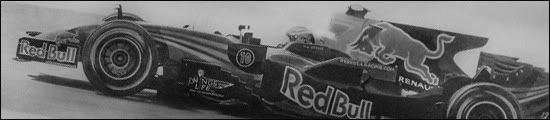
Creativity: 10 : Only two sigs on this site that has a drawing for their sig an this is just outstanding
Appearance: 10 : As i know you created this your self, this Artwork is shocking, I know you spent loads of time on it And the result of it is incrediable, 10 for the Reflections too since i can't do that my self
Difficulty : 10 : Reflection, Car , Background the way you did it is hard an must have talent
Overall 10
Lol wow, first sig ever seen its a perfect, Deserves it though ^^
Creativity: 10 : Only two sigs on this site that has a drawing for their sig an this is just outstanding
Appearance: 10 : As i know you created this your self, this Artwork is shocking, I know you spent loads of time on it
Difficulty : 10 : Reflection, Car , Background the way you did it is hard an must have talent
Overall 10
Lol wow, first sig ever seen its a perfect
Explicit signature removed.
-
Porsche-AG
- Unbeatable
- Posts: 2581
- Joined: 22 Jun 2006, 03:12
- Location: Canada
Re: Rate the signature above you!
Creativity: 6 - There's quite a few sigs with anime characters already.
Appearance: 8 - Love the effects and contrast of the two sides. The nipples are the centre of attention
Difficulty: N/A - Like jacoja said, it's hard to tell exactly what you did.
Overall: 7 - Probably your best sig yet.
Appearance: 8 - Love the effects and contrast of the two sides. The nipples are the centre of attention
Difficulty: N/A - Like jacoja said, it's hard to tell exactly what you did.
Overall: 7 - Probably your best sig yet.

-
S2000_Skyline12
- Unbeatable
- Posts: 3538
- Joined: 05 Jan 2005, 23:59
- Location: Long Island, New York Birthday:12.23.92
Re: Rate the signature above you!
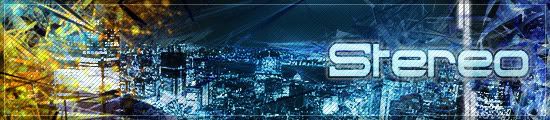
Creativity:6- Not many signatures on cities around here
Appearance: 8- Clean. I like it. Old, but I still like it.
Difficulty:4- A C4D, some blending on it, text and a scanline pattern near the text
Overall: 6- Nice sig.
Appearance: 8- Clean. I like it. Old, but I still like it.
Difficulty:4- A C4D, some blending on it, text and a scanline pattern near the text
Overall: 6- Nice sig.
*sig removed for being too big. max size 550x120px & 50kb*
Re: Rate the signature above you!
Creativity: 8 (not many music sig's that I've seen around here)
Appearance: 9 (clean, but also detailed at the same time)
Difficulty: 8 (looks like you effectively mixed C4D's, blending modes, shapes, and clipping masks to get that unique effect.)
Overall: 8.3
Appearance: 9 (clean, but also detailed at the same time)
Difficulty: 8 (looks like you effectively mixed C4D's, blending modes, shapes, and clipping masks to get that unique effect.)
Overall: 8.3
Re: Rate the signature above you!
8- Looks, magic, totally unique and amazing detail... very good lighting too. It's a top quality sig. It's only the colours that seem a bit bland compared to other sigs, and the strong glow making it hard to see what's going on that lose points here.
Mine... both sigs haven'nt been rated, curious to see what you think of both.
And the first, no it's not a joke... it's a "joke".

Mine... both sigs haven'nt been rated, curious to see what you think of both.
And the first, no it's not a joke... it's a "joke".
Lol... odd thing to put on deviant art eh? Well, it is intended for "Signature Competition #46 - Make something scary" on the NFS Unlimited creativity forum.
MEANING-
Well, it's only the hardest subject you can pick...
It takes serious strength, determination, and courage to even glance at this paper, let alone tackle it. Enough to strike fear into the hearts of any genius... it even stumps maths professors.
So... it is not just scary, it is horrifying!
EDITING-
Only the header is used, the year, and text under the header has been modified. The SACE registration label had to be placed there... it's a signature, so it has to have my user name there. The idea is the interesting part, other than that, simple textures have been used to make a small sticker, and to give the paper some texture.
-
KammyworldRacerGT4

- Drift King

- Posts: 787
- Joined: 10 Jul 2007, 02:44
- Location: In my Tuning Garage, where else?
- Contact:
Re: Rate the signature above you!
7*. The smoke isn't realistic IMO.
*sig removed for being too big. max size 550x120px & 50kb*
-
snoopdogg879

- Drift King
- Posts: 366
- Joined: 01 Sep 2006, 20:36
- Location: Sitting in a Mitsubishi Lancer Evolution IX MR Edition that is fully tricked out
- Contact:
Re: Rate the signature above you!
seeing as your sig is *sig removed for being too big. limitations are 550x120px & 50kb*
Creativity: 1
Appearance:1
Difficulty:1
Overall:1
And i dont have to explain why i gave you that
Creativity: 1
Appearance:1
Difficulty:1
Overall:1
And i dont have to explain why i gave you that
*sig removed for being too big. max size 550x120px & 50kb*


Re: Rate the signature above you!
Ditto. Yours was >100kb.
Re: Rate the signature above you!
Big lawl. 
Btw, let's keep this running.
Creativity: 8
Appearance: 3
Difficulty:2
Overall: 4.3
Btw, let's keep this running.
Creativity: 8
Appearance: 3
Difficulty:2
Overall: 4.3


-
Porsche-AG
- Unbeatable
- Posts: 2581
- Joined: 22 Jun 2006, 03:12
- Location: Canada