Rate the signature above you!
-
An Exotic Classic
- Turbo Charged

- Posts: 66
- Joined: 09 Mar 2009, 23:51
- Location: "Home"
Re: Rate the signature above you!
I like the colors in the sig, and the outlook view of the city. 9/10

-
_BLAHHEAD_

- Turbo Charged
- Posts: 123
- Joined: 07 Oct 2008, 04:01
- Location: In the land of the... people?
Re: Rate the signature above you!
Looks cool, but I not sure what that car is or what Day177017 is. 8.99/10

-
Evil Kid Weaselmush

- Turbo Charged
- Posts: 178
- Joined: 15 Dec 2005, 21:45
- Location: United States
- Contact:
Re: Rate the signature above you!
4.3756814379131276097047.../10

Re: Rate the signature above you!
4- It's easy as hell. A cropped pic of an NFSU car with your initials on it.

-
Porsche-AG

- Unbeatable

- Posts: 2581
- Joined: 22 Jun 2006, 03:12
- Location: Canada


-
Zotic+

- Drift King

- Posts: 903
- Joined: 10 Oct 2008, 05:08
- Location: Southern California in the desert where it gets 130 degrees
Re: Rate the signature above you!
8, the sig matches the colors in avatar lol, GTR FTW

Instagram @SupraHKS

Re: Rate the signature above you!
I'm gonna have to go with a 5.
Small, blurry photo from Shift with some text placed over it. Not the most aesthetically appealing sig, but it is effective. It says "I play Shift and here's my PSN name if you want to race".
Small, blurry photo from Shift with some text placed over it. Not the most aesthetically appealing sig, but it is effective. It says "I play Shift and here's my PSN name if you want to race".
-
_BLAHHEAD_
- Turbo Charged
- Posts: 123
- Joined: 07 Oct 2008, 04:01
- Location: In the land of the... people?
Re: Rate the signature above you!
8- nice picture, however, your name could stand out more if you are to put your name on it.


Re: Rate the signature above you!
8 - Nice looking Audi here and the angle of the picture is great. The font could be better and maybe cropping too. But I like the transparency and eventhough the colors are dull it doesn't look that boring.

-
Porsche-AG
- Unbeatable
- Posts: 2581
- Joined: 22 Jun 2006, 03:12
- Location: Canada
Re: Rate the signature above you!
8 - Great sig, but for some reason the left and right ends don't look right to me. If you used some transparency on the ends, I think it would help the flow of the signature.

-
S2000_Skyline12

- Unbeatable
- Posts: 3538
- Joined: 05 Jan 2005, 23:59
- Location: Long Island, New York Birthday:12.23.92
Re: Rate the signature above you!
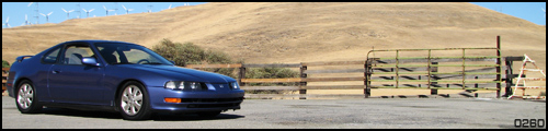
9- It's a very aesthetically pleasing photo. I love the angle of it and the realistic (though it is a game) look of it, makes it pretty sick to me. Great job.
*sig removed for being too big. max size 550x120px & 50kb*